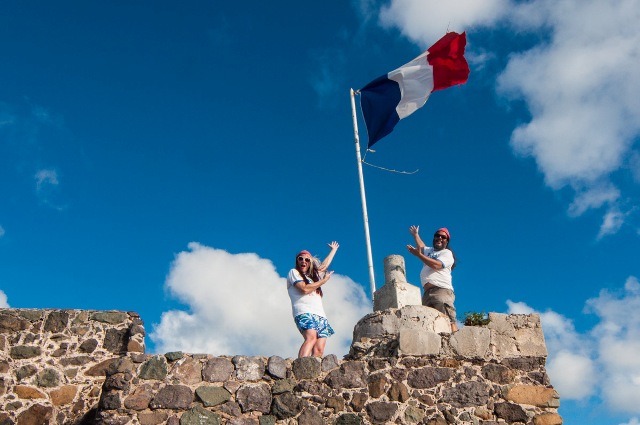
Grand Case, St. Martin—Three new colors are brightening skies—and flagpoles—all over the island for the launch of the new logo of the Les Fruits de Mer association. The updated icon is being celebrated with an exciting large-scale publicity campaign: flags showcasing the redesigned logo are flying all over St. Martin and even around the world.
The non-profit association Les Fruits de Mer, dedicated to wildlife and heritage education, spent the last few months developing the new look. Countless creative designs were considered before the team decided on the new logo, chosen for its visual appeal, originality and symbolic meaning. The logo features a unique “trilogy” of equal-sized color blocks: red representing the red hat worn by Commandant Jacques-Yves Cousteau, white symbolizing the blank page upon which the future is written, and blue for the boundless depths of the sea, the cradle of all life.
“Creating the final design, I felt an electricity coursing through me,” explained designer Stephen Winkel. “The logo was so unique, but also so simple, as if a mystical force had revealed to me a design that had existed since the dawn of time, waiting to be discovered.”

Rather than simply unveil the new logo online, the association decided to promote the launch with flags featuring the novel design. “We felt the flag concept was a great way to introduce the new logo, but we had no idea how popular it would be,” said association President Jenn Yerkes. “It seems like overnight the Les Fruits de Mer flag is everywhere, from businesses and schools to public buildings. You really can’t miss it!”
With the success of the new logo, Les Fruits de Mer is considering updating other aspects of the association. According to co-founder Mark Yokoyama, “We may rework the official motto of the association to focus more on our core values of freedom, equal rights and the spirit of brotherhood.”

